

House Painting Colour Ideas That Work in Real Homes
House Painting Colour Ideas for Melbourne Homes
Good house painting colour ideas start with the home you already have. Natural light, flooring, stone, timber, tiles, joinery and the condition of the surfaces all affect how a colour will actually look once it is on the wall.
Instead of choosing colours from a chart in isolation, build the palette around the fixed finishes and the way each room is used. VicPainter helps Melbourne homeowners connect colour choices with preparation, sheen and a practical painting scope.
Start With the Light, Not the Paint Chart
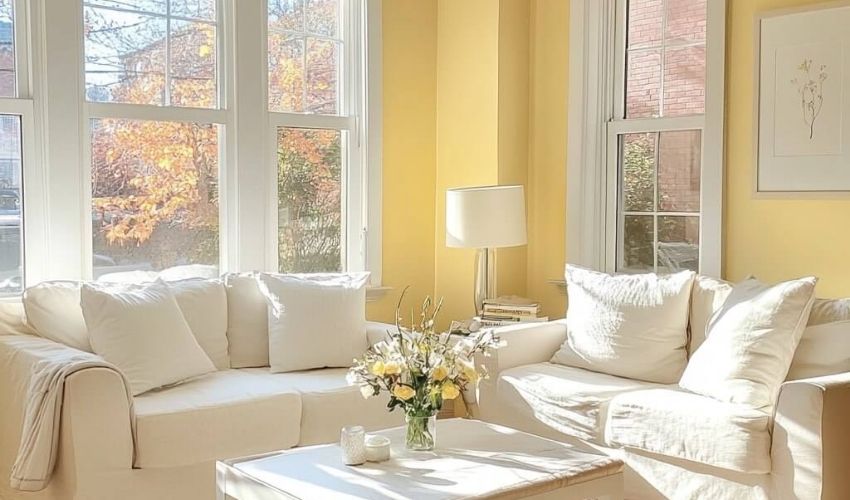
Paint can shift noticeably between morning, afternoon and evening. A white that looks crisp in a bright north-facing room can appear cooler in a shaded room, while a warm neutral can become more yellow under artificial light.
Test larger samples on the actual wall and look at them beside flooring, curtains, furniture and joinery. For a full repaint, house painting services can help connect the palette with the surfaces that need preparation and coating.
House Painting Colour Ideas by Room
The best colour direction changes from room to room. Living areas usually need flow between adjoining spaces, bedrooms often benefit from calmer tones, and kitchens need to work with benchtops, splashbacks and cabinetry that may already carry strong colour.
For lounge areas, see living room painters Melbourne for room-specific repaint planning.
Warm White for Flexible Living Spaces
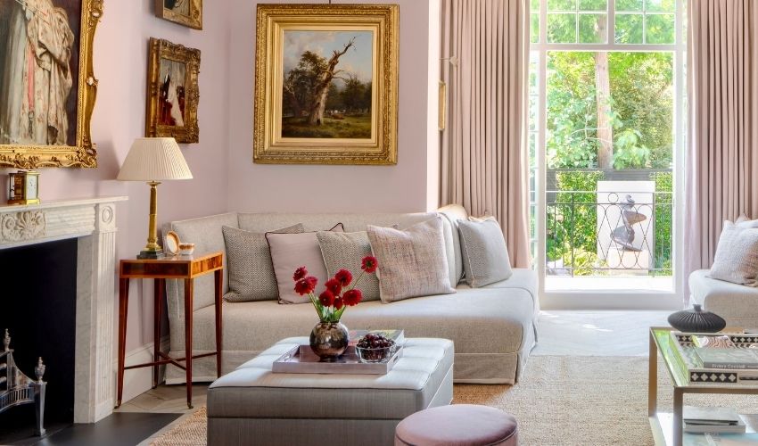
Warm white is useful when you want the walls to sit quietly behind furniture, artwork and timber. The main decision is undertone: some whites lean cream, grey, pink or green, so compare them directly with the fixed materials in the room.
Soft Greige and Stone for a Calm Neutral Base
Greige and stone tones can bridge warm and cool materials without looking as sharp as pure white. They are especially useful where timber floors, beige stone or mixed neutral furniture need one wall colour to connect them.
Muted Green for a Natural Colour Direction
Sage, eucalyptus and green-grey tones can introduce colour without dominating the room. They often work best beside natural timber, warm stone and off-white trims, but samples should be checked because green undertones can change quickly with the light.
Soft Blue or Navy for Bedrooms and Studies
Pale blue can keep a bedroom feeling light, while navy adds depth when the room has enough light and lighter finishes to balance it. Dark colours generally look stronger across a large wall than they do on a small swatch.
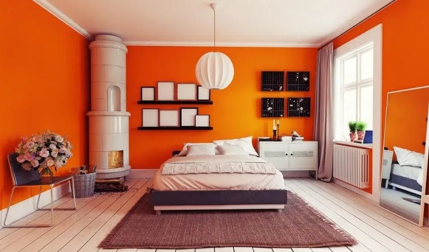
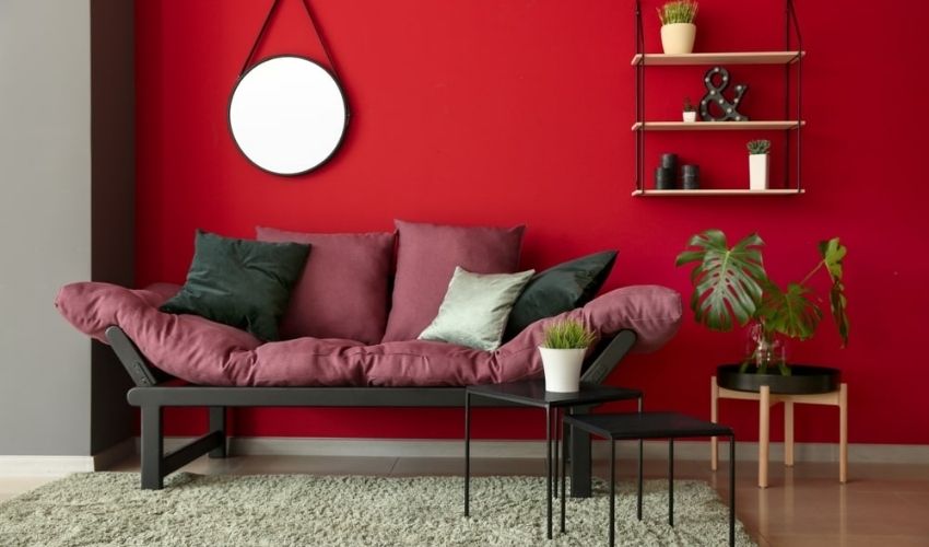
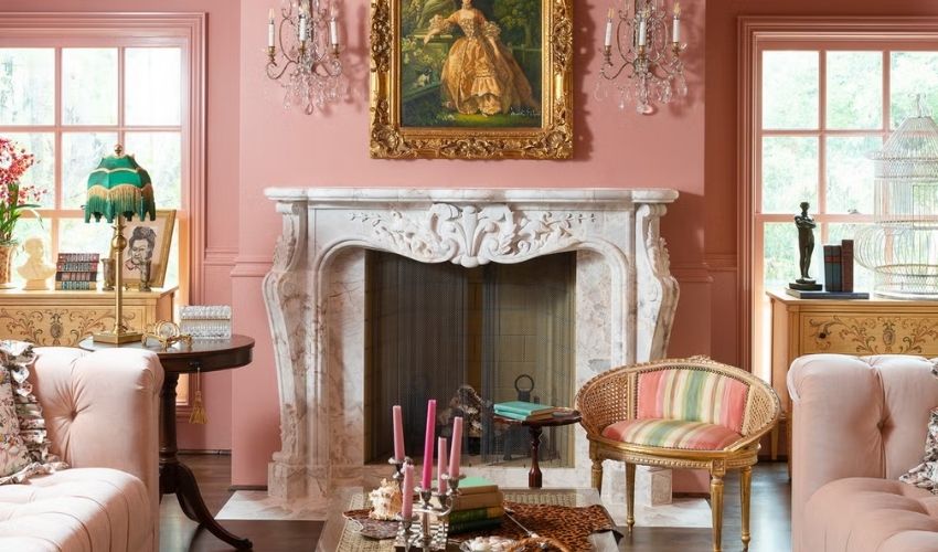
Terracotta, Clay and Dusty Pink for Warm Accents
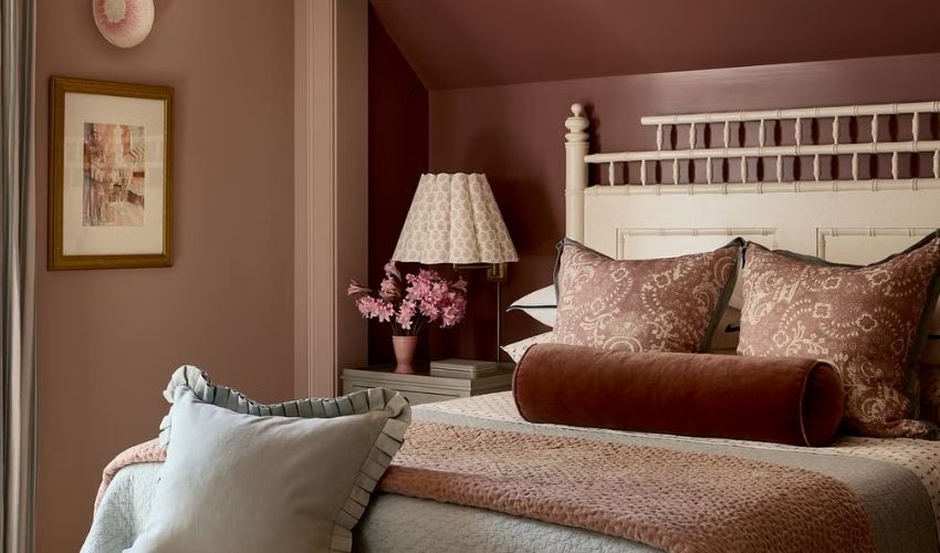
Earthy reds, clay and muted pinks can add warmth without turning the whole home into a bold colour scheme. They are often more effective on a selected wall, powder room or study than across every connected living area.
Exterior House Colour Ideas for Melbourne Properties
Exterior colour should be chosen with the roof, gutters, windows, driveway, garden and neighbouring homes in mind. Unlike an interior wall, these elements are always visible beside the new paint and can make the same neutral read warmer, cooler or darker.
Soft whites, stone, warm grey, muted green and charcoal accents can suit many Melbourne homes. Test exterior samples outdoors before approving them. Explore exterior painting services if the project includes weatherboards, render, masonry, eaves, trims, doors or fences.
Build the Palette Around Fixed Finishes
A house already has colour before the first paint tin is opened. Roof tiles, brick, benchtops, stone, timber floors, carpet, tiles and cabinetry all influence the finished palette.
Treat those materials as the anchor, then choose wall, ceiling, trim, door and cabinet colours that support them. This reduces clashes between undertones and helps the new paint feel connected to the property instead of added on afterwards.
Add Colour Without Making the Home Feel Busy
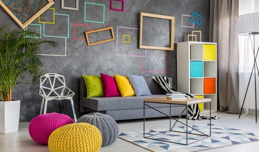
Colour does not need to cover every wall. A stronger front door, powder room, study wall, island or selected bedroom wall can add personality while the main areas stay calm.
Joinery can also carry colour well when the substrate is suitable and properly prepared. Read about cabinet painting if kitchen, laundry or vanity cabinetry is part of the update.
- Use one main neutral to create flow through connected spaces.
- Choose one or two stronger accents rather than a different feature colour in every room.
- Repeat the accent in smaller details so it feels intentional.
- Avoid mixing several whites unless their undertones work together.
- Use darker colours where there is enough light or a clear design purpose.
Prepare the Surface Before Final Colour Approval
Fresh paint can make dents, cracks, stains and patchy repairs easier to see. Surface preparation should therefore be considered before the final colour and sheen are approved.
Use wall repair services for dents and local damage. Larger cracks or damaged plaster may need plaster repair before painting.
Choose Colour and Sheen Together
The same colour can look different in matt, low-sheen and glossier finishes because sheen changes how light reflects from the wall. This matters most in hallways, kitchens, bathrooms, doors and trims where cleaning and durability also influence the product choice.
A lower sheen can help keep large wall areas visually calm, while higher-sheen finishes are often used selectively on trim, doors or high-use surfaces where the coating system calls for it. Always confirm the actual product specification rather than choosing sheen by appearance alone.
Create a Room-by-Room Colour Schedule
A written finish schedule keeps the project simple once painting starts. List each room or exterior area, the surface, colour, sheen and product type. Include walls, ceilings, trims, doors, cabinets, exterior accents, fences and touch-up areas.
For boundaries and outdoor elements, use the existing fence painting colour ideas guide so the fence works with the house and landscape rather than becoming a separate colour decision.
- Check samples in morning, afternoon and evening light.
- View colours beside floors, tiles, stone, timber, curtains and joinery.
- Choose ceilings, trims, doors and walls as one palette.
- Confirm sheen and coating type before work starts.
- Repair dents, cracks, stains and peeling paint before final coats.
- Keep a written record of approved colours and surfaces.
Turn Colour Ideas Into a Clear Painting Scope
Colour ideas become useful when they match the actual painting scope. A quote should confirm the surfaces included, preparation, products, coat system, access and timing.
VicPainter can review photos and project details through a painting quote request. For wider service information, professional painters in Melbourne can help plan a residential repaint, while business premises may need commercial painting staging and access planning.
Useful quoting tip: send photos of each room or exterior side, close photos of damaged surfaces, and images of the fixed finishes you plan to keep. This makes both colour planning and scope discussions clearer.
House Painting Colour Ideas FAQs
What house painting colours are easiest to live with?
Warm whites, greige, stone, soft beige and gentle grey are flexible starting points, but the undertone still needs to work with the existing floor, stone, timber and natural light.
Should interior walls and trims be the same colour?
They can be. Using the same colour in different sheens can create a quieter, more continuous palette. A slightly lighter or stronger trim colour can also work when you want the doors and architectural details to stand out.
What exterior colours suit Melbourne homes?
Soft whites, warm greys, stone, muted greens and charcoal accents can work well, but the roof, brick, windows, garden and surrounding streetscape should guide the final choice.
How many paint colours should one house use?
Many homes can be handled with one main wall colour, one trim or ceiling direction and one or two accents. More complex homes may need a wider schedule, but each extra colour should have a clear purpose.
Should I test paint samples before choosing?
Yes. Test samples on the actual surface and look at them at several times of day. A colour viewed under showroom lighting or on a small printed card can behave differently in your home.
Ready to Turn Colour Ideas Into a Painting Plan?
Send VicPainter photos of the rooms, exterior areas, fixed finishes and any damaged surfaces. A clear brief makes it easier to connect colour choices with preparation and the actual painting scope.
